Table of Contents
Interface presentation for detecting molecular traces in a sample
User manual
Ownership : Fujitsu Systems Europe
Summary: This document describes the user interface developed as part of the Fujitsu Chromatography On Demand solution to automate chemical traces detection in sample.
General information
- The application is a web application, so the web mechanisms work:
- Refresh the application: F5 key / browser Reload button
- Rewind: Alt + ← / Browser arrow ← keys
- Go forward: Alt + → / browser → arrow keys
- Close a window: Esc key
- The application uses web browser cookies to save user preferences such as the proportions between the different panels of a view, the filters applied to lists, the configuration of tables, the interface colours, the size of chromatograms and the navigation display.
- The application is optimized for a screen resolution of 1920x1080px.
- The application is optimized to run on the Google Chrome web browser.
- When the URL entered is not correct, a 404 error page is displayed:

Login page
- Check both boxes and click “Sign in using Microsoft” to proceed.

- Connect to Microsoft account to access the Backlog view.


Zone and common areas
Application header

Each view in the application has a common display zone, the title zone:
- The application title :

- The batch upload widget :

- The database widget :

- The message widget (see Message widget) :

- The activity widget (see Activity widget) :

- The search widget (see Search widget):

- The general menu with the first 2 letters of the current user :


Newsletters
Pop-ups are always displayed in the same place, informing the user of what the application is doing:


Information bubbles close after 4 seconds. A progress bar representing these 4 seconds is displayed at the bottom of each message.
You can skip the 4 seconds and close the message by clicking on it.
Similarly, hovering over the message pauses the closing timer, allowing the message to be viewed for as long as you hover over it.
When a message closes, it is automatically added to the message box. (see Message widget)
Tables
General
All the tables in the application have a column sorting mechanism. When you hover over the title of a column, an arrow appears in transparency, indicating that it is possible to sort this column:
Clicking on the column title sorts the column either top-down or bottom-up:
 : Ascending order (A → Z, 0 → 99)
 : Descending order (Z → A, 99 → 0)
All the tables in the application (except Backlog View) have a multiple selection mechanism. A selection box is present as the first column:  .
.
The selection box in the column title allows you to select or deselect all the rows. When a selection is made, a dot appears next to the main selection box to indicate the number of lines selected:  .
.
A button box also appears when a selection is made, offering possible actions to be taken on the selection:  .
.
Clicking on one of the buttons applies the action to all the selected rows. The possible actions will be detailed in the explanatory sections for the various tables in the application.
Each table line that displays an object can be opened in a different browser tab. To do this, press Ctrl + Mouse Click. The new view is automatically opened in a new tab and the object in the row is loaded. It is also possible to view each table object in its raw version as in a database. To do this, press Ctrl + Alt + Mouse Click. A new window appears with the object loaded. You can then explore the object as it is in the database:

All the tables in the application (except Backlog View) can be customised.
Customisation
For customisable tables, hovering over the table displays a customisation button with a cogwheel icon:  .
.
Clicking on this button opens the table customisation window:

From this window, you can change the order of the table's columns (except the selection column, if present), their widths and their visibility.
- Order: To change the order of columns, simply move them manually.
- Width: To change the width of a column, simply change the value in the “size” box.
- Visibility: To hide or show a column, simply click on the button with the eye icon.
 : Visible
 : Not visible
Once you have made your changes, click on the  button to save them or
  to cancel. In both cases, the window closes.
To return to the table's default values, click on the  button, which will also close the window.
Columns
Flags
Some tables have a “Flags” column which is represented by a pictogram representing the level of the most severe flag present for the compound:
 : Question level (only on Backlog View)
 : Information level
 : Attention level
 : Error level
Hovering over the pictogram displays a floating window containing the main details of the flags:

View full details of flags :

The full detailed view uses the information previously seen for the floating window and replaces the single detail of the main channel with the detail of all channels. It is obtained by clicking on the  button in the floating window, and also by clicking on the pictogram of the flag representing its highest level.
The main channel is represented with  .
.
In the case of calibration flags, only the  tab is present. In other cases, the
  tab is also present (see Details).
The  button closes the window.
Notes
Some tables have a “Note” column which is represented by a pictogram explaining that notes have been written for the object in the row (with the number of notes): 
Hovering over the pictogram of a note displays the list of notes:

For each note, the date the note was created, the note message and the user who wrote the note are displayed.
At the bottom of the note display window, there is a button for adding a new note: 
Clicking on this button has the same effect as clicking on the pictogram of a note, and displays the window for editing a new note:

Only the note message needs to be filled in. The  button saves the note and the
  button cancels the creation of a new note.
When no note is present, the button is represented by : 
Notes for Batch objects are displayed differently:

In addition to the Batch notes, it is possible to access the notes of objects inheriting from this batch. Analyses  and calibrations
  . The number of notes displayed on the pictogram of a Batch note is the sum of the batch notes + the number of notes of the analyses and calibrations inherited from this batch.
Clicking on the analysis note or calibration note buttons opens the window displaying the analysis and calibration notes for the inherited batch:

The window has 2 tabs corresponding to analysis notes and calibration notes.
Modification
Some tables have a “Modified” column which is represented by a pictogram explaining that the object in the row has been modified by an operator: 
By clicking on it, a window with all the changes appears:

Each modification is represented as follows:
- The date of the modification and the operator who made the modification are displayed on the left.
- In the centre is a pictogram representing the modification action.
- On the right is displayed a summary of the modification with a pictogram
 allowing the full details of the modification to be viewed in the form of an information bubble:

The  button closes the modifications window. Similarly, as with all windows, clicking outside the window will close it.
Validation
Some tables have a validation column which is specific to the type of table (details of validations are described in the details of the table concerned).
Validation has several states:
If no validation is performed, the validation buttons are all grey: 
If a validation is performed, the corresponding validation button is coloured: 
Validation buttons are exclusive, and clicking on a validation button that has already been activated will remove the validation.
Name badge
Some tables have a “Peak name” column containing a pictogram  . The pictogram appears after the name if the compound is part of a sum molecule.
When hovered over, the badge gives information on the associated sum molecule, and a detailed bubble appears with the name, formula and coefficient:

Chromatogram
Normal view

The normal view is the representation of chromatograms from the Compound chromatogram panel and Analysis chromatogram panel.
Controls
You can zoom in and out of the graph. To zoom in: Ctrl + Mouse Wheel and to move around: Hold down the left mouse button and move around.
Once zoomed or moved, a menu option  appears in Main menu allowing you to return to the default position and zoom.
Information displayed
The name of the compound or analysis is displayed at the top. Here it is “TNFA”.
Transitions
The transitions (channels) available for the compound or analysis are displayed in the top left-hand corner.

The colour of the text corresponds to the colour used to represent it in the graph.
The  pictogram indicates which channel displays its area. By clicking on another transition, the new transition obtains the pictogram with the associated colour and thus displays its area.
Integration
The integration of the area under the curve is represented by orange colouring under the integrated curve and bounded by two points represented by the pictogram  .
.
The integration displayed is always that corresponding to the selected transition (see Transitions).
There are 2 possibilities for reinstatement:
- Either the points (
 ) are already present, and you simply move these points to the desired location. If the point has an ordinate less than 0, then the 0 ordinate will be applied.
 - If no points () are present, you need to create them. To do this, press Ctrl + left click on the curve where you want to place the first point. Press Ctrl + left-click again to place the second point where you want it. The points you create will always be positioned vertically on the curve.
When you hover over the integration points, an information bubble appears showing the coordinates of the point:  .
.
A Main menu option allows you to return to the default positions:  .
.
A Main menu option allows you to apply the integration to the entire series:  .
.
Retention time
When known, the calibration retention time and the corrected retention time are displayed on the graph by a vertical bar:
Calibration retention time: orange colour, “RT Cal” label
Corrected retention time: blue colour, “RT Cor” label
Flags
In the top right-hand corner, a pictogram is displayed representing the level of the most severe flag present for the compound or analysis. Clicking on it opens the flag details window (see Flags).
Menu
When you hover over a chromatogram, the  menu button appears in the top right-hand corner:

Hovering over the menu button opens the menu:
Detailed view

The detailed view makes it easier to visualise the chromatogram and to superimpose curves for comparison.
This view has 3 zones:
- An area where you can set the chromatograms you wish to view.
- A graphical area where the selected chromatograms are displayed
- A tabular area where the selected chromatograms are displayed
You can change the display proportions between the graphics area and the other two by moving the separator represented by  . By hovering over the separator, the indicator changes to
  indicating that you can click and drag this separator.
Tabular display area

The result table contains columns which can be sorted and customised as explained in section Tables.
By default, without even changing the selection from the Parameter area, the analysis by which the detailed view was opened will always be present, even if the tick corresponding to its type is not checked.
Details of specific columns :
- Display: allows you to display/hide the desired analysis channel from time to time:
 : visible.
 : not visible.
- Colour: used to identify the corresponding curve on the graph by its colour. The type of line used to surround the colour follows the following rule:
- Channel 1: solid curve
- Channel 2: dashed curve
- Channel 3 and above: dotted curve
Clicking on the colour opens the colour customisation window:

The colour can be changed using the “Change colour” insert. A change is automatically applied to the “New colour” insert to show the future colour. A reminder of the current colour is displayed in the “Old colour” insert.
When a colour is changed, all the rows in the table corresponding to the same analysis will be changed in order to keep the same colour per analysis. The colours are stored in the settings panel.
- Channel: a
 is present to indicate that this is the main channel.
Hovering over a line in the table makes the curve in the Graphic display area thicker, making it easier to see:

Parameter area

- RT: Displays/hides retention times.
- Range: Displays/hides “calibration” type analyses.
- Quality: Displays/hides “bio-matrix, doped bio-matrix or end standard” type analyses.
- Blank: Displays/hides “Blank” type analyses.
- Peak: Displays/hides the integration of the graph. You can choose which channel you want to view the integration on. A drop-down choice list is available next to the “Peak” tick:
 .
. - Channels: Displays/hides the different channels for the selected analyses.
- Samples / Others: Allows you to add the curves of “sample or other” type analyses to the graph via a multiple choice list:

Once added, a sticker showing the analysis is displayed in the Samples / Others field: 
Use the cross to remove the analysis from the selection.
Graphic display area

Information displayed: see Information displayed, with a few differences:
- The menu button is always displayed and is represented by :

- Transition colours are grouped by analysis. All transitions in the same analysis will have the same colour.
- The curve style corresponds to the channel number
- Channel 1:

- Channel 2:

- Channel 3 and above:

- The thickness of the curve is thicker if its correspondence in the Tabular Display Area is hovered over:
- Not hovered:

- Hovered:

Message widget
The message widget displays all the messages (information bubbles) that have appeared during the user's session.
The widget button displays the status of the message box:
- When no new message is present:

- When unread messages are present (with the number of messages):

Hovering over the widget button displays a tooltip with a maximum of the last 10 unread messages:

Clicking on the widget button opens the messages window:

This window lists all the messages and allows you to filter their display.
The banner consists of 2 parts (filter section and on notification section)
- The filter section allows you to filter the messages to be displayed:
 : If activated, only displays new messages
 : If enabled, displays “info” type messages.
 : If enabled, displays “success” messages.
 : If enabled, displays “warning” messages.
 : If enabled, displays “error” messages.
- The notification section:
- At the right side, the notification bell icons allows you to deactivate
 or activate
  the notification popup windows message.
The section messages are displayed in the form of a list with icon and message:
- The pictogram
 indicates that this is a new message.
The  button is used to close the window (same function as the Escape key). By closing the window, all messages that were previously “new” will no longer be so in the future.
Activity widget
The activity widget displays all the operations launched on the platform. System and user actions.
The widget button shows how many tasks are currently running:
- When all jobs are finished:

- When tasks are being processed:

Hovering over the widget button displays a tooltip listing all the tasks currently being processed (with the user who launched the task, the operation performed and the time it was run):
Clicking on the widget button opens the activities window:

When this window is opened, if the number of results allows it, the view is automatically scrolled to the most recent element. And if you are scrolling manually, a button appears which takes you directly to the most recent element: 
The button closes the window (same function as the Escape key).
The activity window consists of 2 parts:
- The filter section allows you to filter the results according to the criteria selected:
 : filters activities for the current year/month/week
 : Display activities with a creation date between From and To.
 : Filters to manage the results displayed according to their status (RUNNING / FINISHED / FAILED)
 : Allows you to perform an additional filter with the following filter criteria:
- The name of the user who launched the task
- The name of the analysis
- The name of the molecule
- The name of the batch
- The action (update_batch, retrieve_batches, build_batch, reset_ua, reset_uc, validation, main_chanel, update_peak, istd, copy, move, export_to_lims, update_standard_points, update_interpolation, reset_calibration, update_v_ext, update_dilution, update_weighing).
- The results section:
A result is represented as follows:

- On the left is the date the action was created and the user who launched it.
- In the centre, the status of the action:
 The action is running
 The action has finished successfully.
 The action ended with an error.
Finally, the right-hand side displays information about the action. In the event of an error, a pictogram  appears and when you hover over it, a tooltip with the error message is displayed:

Search widget
The search widget enables you to find an analysis or batch in the database and display it directly, without having to go through the application's traditional navigation.
Entering data in the search box opens the global search panel with the results:

- Each line of results displays information:
- An icon to distinguish analyses
 from batches
- The name of the analysis or batch
- The creation date (for batches only)
- The name of the associated batch (for analyses only)
- The type of analysis or batch
- The path of the physical file
- Clicking on a line opens the analysis or batch page directly.
- The
 button closes the search window (same function as the Esc key).
Main menu
The menu is opened by clicking on the  menu button on right side of the banner. The menu options are:
 Direct access to the application's main view, (Backlog View)
 Access to the wikiCOD
  Reload the current page (different from F5 which reloads the web page and not just the page content)
 Access to the settings panel (Settings Panel)
 Access to the information panel (Information panel)
 Access to the method manager panel
 Access to the method file convert panel
 Exit the session. To return, you will need to re-authenticate (Login page)


Information panel
This panel provides a clear summary of the user's access rights, system environment, version details and allow to the release notes.

User Information
- Name:
stephane.romdhane2 - Full Name:
stephane.romdhane2 - Admin: ✔ (Indicates administrator privileges)
- Teams:
PublicGuestLaberca
System Details
- Database:
common - Python Service:
alphacod_services - Version:
3.2.0_rc2  : Click on the icon to display the release notes.
Actions
- CLOSE – Closes the information panel.
Settings Panel

This interface is a settings panel that allows the user to configure various aspects of the application.
General Configuration
- Database: Selection of a database (currently
common). - Language: Selection of the display language (currently
Englishwith a UK flag). - Show unknown molecules: Whether or not to display analyses with the “unknown molecule” flag. (
Yes). - Chromatograms display: Displays chromatograms with molecules only or with ISTD chromatogram (
Molecule only). - Show retired batches: Whether or not to display the retired batches (
No).
Performance and Compression
- Task polling (ms): Set to the automatic reload time for the activity panel and the list of batches in the Backlog view(
10,000ms). - Zip compression level: A slider is available for compression level adjustment.
Animation and Caching
- Use animations: Use or disabled interface animations (
No). - Use cache mechanism: Use cache mechanism. (
Yes → Enabled).
Color Customization
- Primary color: Select Primary colour (
dark blue). - Secondary color: Select Secondary colour (
blue).
Concentration Units
- Mass concentration report unit: Selection of mass unit for delivered reports: 'mg/kg', 'μg/kg', 'ng/kg', 'ppm', 'ppb', 'ppt' (
mg/kg) - Volume concentration report unit: Selection of volume unit for delivered reports: 'μg/l', 'mg/l', 'ng/l', 'pg/l', 'n mol/l', 'p mol/l' (
µg/l) - Injected concentration unit: Selection of injected concentration unit : 'μg/l', 'mg/l', 'ng/l', 'pg/l', 'n mol/l', 'p mol/l' (
µg/l)
Other Options
- HTML selection: Allow selection with mouse on page (
Allowed). - Expert mode: Enabled (
Active).
Action Buttons
- Reset Settings: Resets all settings to default by clicking on the red button
 . All the data will be erased and the application will use the default values.
 - Save: To save changes, click on the
 button.
 - Cancel: To discard changes, click on
 .
.
Backlog view

The Backlog view is made up of 2 zones:
- A filter area:
- Backlog: Title of the view.
 : This drop-down list allows you to select the service on which you wish to filter.
 : This drop-down list allows you to select the Chromatography type (
LCorGC) on which you wish to filter. : This drop-down list allows you to select the type of device on which you wish to filter.
 : Switch that allows you to switch to “only unfinished batches” mode. Completed batches with a score of 100% are therefore not displayed.
 : Checkbox to active date filter.This drop-down allows you to quickly apply a date filter. The choices are :
- Filter by current month
- Filter by the current week
- Filter by the day before the current day
- Filter on the current day
 : This filter only displays Batch with a creation date between From and To. The maximum difference between From and To cannot exceed 1 month.
- A results area:
- The results displayed are the batches corresponding to the filters as well as the sub-batches of the displayed batches.
- Results are displayed in table format by default.
- An action button allows you to switch from the table view to the tree view:
 (the button displays the pictogram corresponding to the active view).
- Hovering over this button displays all the possible options:

Tree view :

Table view :

- The table view allows you to sort columns. To do this, simply click on the column title. An arrow appears transparently when you hover over the title to show that you can sort the column.
- Each batch displays information:
 : The bach flags, hovering over the pictogram displays a tooltip with details of the batch flags.

- In the case of a question flag, the details of the question are displayed in the tooltip:

- Batch name
- Status
- Version
- Configuration
- Notes: the notes
- Path: the physical file patch (table view)
- Batch Date (table view)
- Due Date (table view)
- Device: the machine used (table view)
- The priority. Editable via a drop-down menu with 2 options, Normal and Urgent:

- The last user to have worked on the batch. Hovering over this information displays a tooltip showing the last 10 modifications to the batch:


- Batch progress in the form of a progress bar:
 }
}
A tooltip allows you to view the detailed progress of calibrations and analyses:
- Action buttons
 .
.
By clicking on this button, a menu list of actions is displayed:
 .
.
- Open batch: Opens the selected batch.
- Open batch in new tab: Opens the batch in a new browser tab.
- Training batch: Build a training batch with the selected batch.
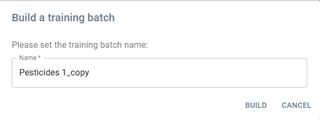
 : Creates the training batch with the specified name.
 : Cancels the creation of the training batch.
- Replace data: Replaces or updates existing batch.
- Mode:
Replace– Replaces the existing batch data.Update– Updates the batch without full replacement.
- Screening:
All– Applies to all available data.Last 4– Only applies to the last four data points.
- Configuration:
- A dropdown menu allowing the selection of different configurations.
- Currently selected:
Pesticides (current).
- Actions:
- YES – Confirms and proceeds with the update.
- CANCEL – Cancels the operation.


- Download report: Exports the batch report in an Excel file.
- Stamp the batch: Marks the batch with an official stamp.
- Retire the batch: Moves the batch to retired status.
- Set batch as calibration reference: Uses the batch as a reference for calibration.
- Generate method: Creates a method based on the batch data.
- See the batch logs: Displays the log history of the batch.
- Explore the batch: Provides a detailed exploration of the batch data.
- Save the batch: Saves the current batch state.
Navigation panel
^Minimized panel^Normal panel^
| |
| |
|
The navigation panel is used to navigate between the different views of the application. This panel is visible from the Batch, Overall, Analysis and Compound views and is always positioned on the left of the interface.
- Backlog: Go to the Backlog View
- Batch: Go to the previous Batch View (not displayed in the Batch View)
- Overall: Go to the Overall View
- Analysis: Display the Analysis view of selected analysis
- Compounds: Display the Compound view of selected compound
Analyses navigation panel
Analyses are represented by the pictogram  .
.
They are displayed in order of the type by default and it can be reorder by user with  icon.
icon.
Each analysis is displayed with its type represented at the end of the button:  .
.
They are displayed in the form of a dot on the pictogram in minimized navigation:  .
.
- List of types :
 : Blank
 : Calibration (standard)
 : Organic matrix
 : Bio-doped matrix
 : Sample
 : End standard
 : Other
- Sample analyses display an information bubble when you hover over them to find out which matrix it is without having to open the analysis:

- Other analyses have an information bubble displaying the full file name :

- Opened analysis : when an analysis is opened, its representation in the navigation list is displayed with a special background to make it visible among the others. The list is automatically scrolled over so that it is always visible:
Compounds navigation panel
Display the compound selected via the Compound view.
- The compounds are represented by the pictogram
 .
. - They are displayed in alphabetical order.
- In minimized navigation, the first 3 characters of the compound are displayed as a dot on the pictogram:

- Compounds display an information bubble when you hover over them, so you can see the full name if it is very long:

- When a compound is opened, its representation in the navigation list is displayed with a special background to make it visible among the others. The list automatically scrolls over it so that it is always visible:
Customisation
- Pin the navigation panel :
 : The navigation panel is always visible.
 : The navigation panel hides automatically and reappears when you hover over its minimized view.
- Modify the display proportion between analyses and compounds:
 : This separator allows you to change the display ratio between the number of analyses and compounds displayed by moving it up or down.
- Search: Analyses and compounds can be filtered using the associated search component:
- By clicking on the
 search button,
  a text box appears in which you can enter the filter you want.
Batch view

The view is divided into 6 zones:
When the separator between 2 panels is present and represented by , it is then possible to change the display proportions between them. By hovering over the separator, the indicator changes to indicating that you can click and move the separator.
Batch Information panel

This panel provides key details about a specific batch, including its status and alerts.
Batch Details
- Batch Name:
Batch Pesticides 1 - Instrument:
Shim 21 - Priority:
Urgent
Status Indicators
- Screening: A blue tag indicating the used screening information.
- Memory Effect Warning: An orange warning tag indicating a potential memory effect issue.
Notifications and Metrics
- Unread Notification: A blue notification icon with one unread message (see Batch notes).
- Report Data: An icon suggesting the availability of batch reports.
- Progress Indicators: Two circular progress indicators showing values of the calibration's validation
0.4%and1.4%for analyses' validation.
User and Options
- User Profile: Displayed as
stin a circular icon. It's the last operator who worked on the batch (first 2 letters of the name) - More Options Menu: Represented by a three-dot icon for additional actions.
More Options Menu
Same actions button as in the Backlog view:
- Open Batch in New Tab: Opens the batch in a new browser tab.
- Training Batch: Build a training batch with the selected batch.
- Replace Data: Replaces or updates existing batch.
- Download Report: Exports the batch report in an Excel file.
- Stamp the Batch: Marks the batch with an official stamp.
- Retire the Batch: Moves the batch to retired status.
- Set Batch as Calibration Reference: Uses the batch as a reference for calibration.
- Generate Method: Creates a method based on the batch data.
- See the Batch Logs: Displays the log history of the batch.
- Explore the Batch: Provides a detailed exploration of the batch data.
- Save the Batch: Saves the current batch state.
Minimize - Maximize batch information panel
The panel can be minimized to increase the display area for other panels.
When you hover over the panel, a tick appears : 
Clicking on it reverses the tick and retracts the panel:
In retracted mode, the tick is always visible. 
Calibration panel

The Calibration panel consists of 2 sub-panels:
- A table: displays all the calibration compounds
- A graph: displays the calibration curve for the compound in the selected table.
The delimiter between the two sub-panels can be moved vertically to increase or reduce the size of the 2 sub-panels.
Under table panel
The calibration compounds are displayed in a filtered table. There is a filter section and a results section.
Filters
Calibration offers 3 types of filter:
- Filters on the state of the compound:
- ISTD: Internal standard
- OK: correct calibration
- KO: calibration not correct
- Validation filters:
 : compounds not yet validated
 : compounds validated as OK
 : compounds validated as KO
- Search filters:
 : the search is based on the values displayed in the columns of the Results table. When an entry is made in the search field, a cross appears to delete the search entry and remove the filter applied to the table:
Results

The result table contains sortable columns, multiple selection and customisation as explained in section Tables.
Clicking on a line in the table displays the calibration graph for the compound in the Graphics sub-panel (the text  is displayed if no selection is made). The line is then displayed with a coloured background so that you can see which line in the table corresponds to the graph displayed.
Double-click on a line to open the compound in its Compound view.
Details of specific columns :
- Selection (see Tables):
- Notes (see Notes)
- Choice of multi-selection:
 Validation OK / Validation KO
 - Flags (see flags)
- Modified (see modification)
- ISTD: Possibility of choosing ISTD the internal standard of the compound via a drop-down list where the current ISTD is displayed with a grey background.

Graphics sub-panel

If a compound has been clicked beforehand, its calibration curve is displayed as above. This view is made up of 2 parts, a parameter setting part and a graphical representation part.
Settings
It is possible to modify certain calibration parameters, as well as the display:
 : Select the calibration channel you wish to view.
 : Allows you to change the appearance of the curve by changing the type of interpolation from Linear or Quadratic..
 : Change the function used to calculate the weight from 1, 1/C or 1/C²..
 : Change the zero point management from Ignored, Included or Force through.
 : Reset to default values.
Visualization

* Information is displayed on the graph:
- Q: the transition
- R²: the value of the coefficient of determination R².
- y: the interpolation function
 : the calibration flag (see Flags)
* Context menu:
- Right-clicking on the graph displays a context menu allowing you to include or exclude assortment points:
- Once the inclusion or exclusion has been selected, the range points that are candidates for the chosen action are displayed:


* Display point:
- An included point is displayed by :

- An excluded point is displayed by :

- Hovering over the points displays a bubble showing the coordinates of the point:

- When a reference point is present, it is displayed by a red circle:
 . Its correspondence on the 2 axes is drawn :

* Other action:
- You can zoom in and out of the graph. To zoom in: Ctrl + Mouse Wheel and to move around: Hold down the left mouse button and move around.
- Once zoomed or moved, a
 button appears, allowing you to return to the default position and zoom.
Quality Control panel

Quality Control panel presents Quality Control analyses table, including Blank, Matrix bio, End Standards, and Calibration samples.
Table Columns
- Visibility: Checkbox or eye icon to show/hide the entry.
- Reported: Checkbox indicating whether the data has been reported.
- Flags: Icons or markers for specific flags.
- Notes: A document icon indicating the presence of notes.
- Name: The name of the batch or sample.
- Level: A numerical value representing the concentration level.
- Type: The category of the sample (e.g.,
calibration,blank,matrix_bio). - Approval Indicators:
- Thumbs Up (👍): A numerical value indicating approval or validation.
- Thumbs Down (👎): A numerical value indicating disapproval or rejection.
- Suffix: Additional metadata classification (e.g.,
meta,neg,default). - Progression: A visual progress bar representing the processing or completion status.
- More Options Menu: Represented by a three-dot icon for additional actions.
Sample Entries
The table contains multiple samples with different attributes, such as:
- Calibration samples at different levels (e.g.,
10m 30-11,std 1 ppb). - Blank samples (e.g.,
blc_001,blc_002). - Matrix bio (e.g.,
pb,pbd). - Matrix bio (e.g.,
pbd). - Matrix Bio Doped.
- Std End.
Features and Interactivity
- First column with checkboxes allows users to select multiple rows at once.
- The user can toggle visibility using checkboxes or eye icons.
- Notes can be accessed via document icons.
- Sorting is available (e.g., by Name with an upward arrow).
- A context menu (three-dot icon) provides additional actions for each entry.
- Clicking on a line in the table opens the analysis in its Analysis View.
- Open in fullscreen icon :
 (top right corner)
Select multi rows
- By clicking on the first column, the user can select multiple rows at once.
- The selected checkboxes are highlighted in blue.
- The user can then perform analyses actions on the selected rows by clicking on
 popup icon.
 - Open action panel to move selected analyses (see Move analyses action).
Move analyses action
Move the analyses to outside the panel is the action available in 3 panels : Quality Control, Customer Samples and Others.
Users are prompted to confirm and configure the selected analyses

description
- Title: Move outside …(depend on the called panel)
- Message text …(depend on the called panel)
- The Move outside panel is popup with the list of selected analyses
- Configuration options: for each analysis, you need to select its new type, which will have an impact on the destination panel.
- Type dropdown: Allows selecting a new type for the analysis. The dropdown menu includes Blank, Calibration, Matrix Bio, Matrix Bio Doped, Other, Sample and Std End
- Depending on the type selected, a second piece of information may be requested (or even a third) as shown below
- Full list of options by type:
- Blank: None
- Calibration: Level and suffix
- Matrix Bio: None
- Matrix Bio Doped: Level
- Other: None
- Sample: num
- Std End: Level
- Level input (Required) : A numerical value representing the level.
- Suffix dropdown:
- Options to select a suffix (default is “default”).
- Other suffix options might be available based on system settings.
- mun input (Required) : A numerical value representing the sample number.
- Level and number are mandatory and locks the activation of the
 button.
 - Recompute Calibration Checkbox:
- If checked, recalibrations may be triggered after moving the analyses.
- Action Buttons
- MOVE: Confirms and executes the move (disabled until all required fields are filled).
- CANCEL: Cancels the operation and closes the window.
Example, move the analyses from the Quality Control panel to another panel example

Customer Samples panel

The Customer Samples panel displays analyses table of the “Sample” type. It contains:
* Title: Customer Samples
* Table: sortable columns, multiple selection and customisation.
* Action Icons (Top Right)  :
:
- Summation Icon
 : To open report the results to LIMS.
 - Expand Icon: Likely to open the panel in full-screen view.
Table Columns
- Checkbox: Checkbox icon allows users to select multiple rows at once.
- Reported: Checkbox indicating whether the data has been reported.
- Flags: Icons or markers for specific flags.
- Notes: A document icon indicating the presence of notes.
- Name: The name of the batch or sample.
- Approval Indicators:
- Thumbs Up (👍): A numerical value indicating approval or validation.
- Thumbs Down (👎): A numerical value indicating disapproval or rejection.
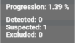
- Progression: A visual progress bar representing the processing or completion status. By hovering over the progress component, an information bubble appears detailing the progress:
- More Options Menu: Represented by a three-dot icon for additional actions.

Features and Interactivity
- First column with checkboxes allows users to select multiple rows at once.
- Notes can be accessed via document icons.
- Sorting is available (e.g., by Name with an upward arrow).
- A context menu (three-dot icon) provides additional actions for each entry.
- Clicking on a line in the table opens the analysis in its Analysis View.
- Open report the results to LIMS icon (top right corner)
- Open in fullscreen icon : (top right corner)
- Actions buttons when a row or multiple rows are selected:
 (Top Left, Inside the Blue Box)
 : Moves selected samples between different categories (see Move analyses action).
 : Move or copy in new sub-batch
 : Move or copy in existing batch or sub-batch
Action Buttons views
- : Move/copy in new sub-batch:
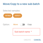
- To choose between copy or move mode, click on the Move/Copy status component. The selected mode is displayed in colour, the other remains grey.
- The “Sub-batch name” field is used to define the name of the future sub-batch. This field is mandatory and unlocks the
 button. As long as the field is empty, the button remains disabled.
 - The button will copy or move the image and the
 button will cancel the action.
- : Move/copy in existing sub-batch or batch:
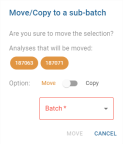
- To choose between copy or move mode, click on the Move/Copy status component. The selected mode is displayed in colour, the other remains grey.
- The “Batch” drop-down list is used to select the sub-batch to which the copy or move should be made. The choices correspond to existing sub-batches whose parent batch is the batch from which the selected analyses are derived. This field is mandatory and unlocks the button. As long as the field is empty, the button remains disabled.
- The button will copy or move the image and the button will cancel the action.
- Exports to LIMS:
- : Clicking on this button opens a confirmation window before sending the data to the LIMS:
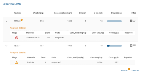
- This window displays weight, concentration, dilution, v_ext, progression and additional information (Package
 and Remarks
  ) for each assay selected.
 - Package and Remarks are displayed by hovering over the pictogram, and a detail bubble appears:
- An extension button
 unfolds the analysis line and displays the list of all the compounds in the analysis and their associated sum molecules, which will be sent to the LIMS.
 - For each compound, its flags are displayed (see Flags), along with its name, event, status, concentration and whether it has already been sent.
- In the Analysis, a pictogram
 is displayed when all the validations of the analysis have not been completed. A tooltip can be used to check the status of validations:
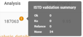
- This pictogram is used on the
 button.
 - The
 button will send it to LIMS and the button will cancel it.


Others panel

The Others table displays analyses of type “Other” (non-blank, non-bio-matrix, non-bio-matrix spiked, non-end standard, non-calibration and non-sample). Like the Quality Control panel and Customer Samples panel, it lists the analyses in a table and has the following actions.
- It contains sortable columns, multiple selection and customisation.
- Clicking on a line in the table opens the analysis in its Analysis View.
- : Moves selected samples between different categories (see Move analyses action).
- Expand Icon: Likely to open the panel in full-screen view.
Analysis view
Global view

Detailed view
The view is divided into 5 zones:
When the separator between 2 panels is present and represented by , it is then possible to modify the display proportions between them. By hovering over the separator, the indicator changes to indicating that you can click and move the separator.
Analysis information panel

Analysis Info Panel provides an overview of the current batch analysis, displaying key information, along with multiple action and filter icons.
Description of the "Analysis Info" Panel
Key Elements in the Panel
First line
Pesticides 1→ Indicates the batch name.Dilution: 1→ Shows the dilution factor or related dilution sample. : Run the A.I assistant on the analysis
 : This button opens the corresponding LIMS page (not visible if the page does not exist)
 : Report analysis data.
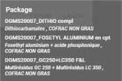
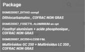
 - Package information :
- 2 icons are accessible:
 : Grey information icon when none accessible information
  : Colour information icon. Hovering over this pictogram displays a bubble containing the Package information
- example:
 or
or  : Hovering over this pictogram displays a balloon containing the remarks.
 : Open automatic validation window. Analysis auto validation panel
 : Progression of the analysis validations.
 : Open view setting of table and chromatogram View settings.

Second line
- The analysis view offers 5 different types of filters
- Dropdown Menu (
None) : This dropdown (next to *Pesticides 1*) likely allows users to select a filter and edit filter. Global filters for compounds that can be displayed: (Global filters)
 - State filters on the state of the compound:
 : ISTD (=Internal standard)
 OK (only for compounds of type other than “Sample” or “Other”)
 KO (only for compounds of type other than “Sample” or “Other”)
 Detected (only for compounds of type “Sample” or “Other”)
 Suspected (only for “Sample” or “Other” compounds)
 Excluded (only for “Sample” or “Other” type compounds).
- Requested filters:
 : Compounds that have been requested by the customer.
- Validation filters :
- : Compounds not yet validated
- : Compounds validated in OK (only for compounds of type other than “Sample” or “Other”)
- : Compounds validated in KO (only for compounds of type other than “Sample” or “Other”)
 : Compounds validated as Detected (only for compounds of type “Sample” or “Other”)
 : Compounds validated in Not Detected (only for “Sample” or “Other” compounds)
 : Compounds validated as Relaunch (only for compounds of type “Sample” or “Other”)
- Flags information: (not visible if no flag)
- example of the flag returned by the analysis:

- hovering over the flag label, an information bubble appears with details of the flag
 : Remove the active filter.
 : Download data as CSV file.

5. Search bar:
- The search is based on the values displayed in the columns of the Compound Table Panel. This “search” filter is also applied to the Compound Chromatogram Panel. When an entry is made in the search field, a cross appears to delete the search entry and remove the filter applied to the table:
- On the status, validation and miscellaneous filters, a bubble is displayed to indicate the number of elements corresponding to the filter:
 .
. - When a filter is activated, its theme changes from grey to the chosen secondary colour (depending customer options, case of orange).:
bottom section
The information panel can be reduced to increase the display area for the other panels. When you hover over the panel, a tick appears:
Clicking on it reverses the tick and retracts the panel:
In retracted mode, the tick is always visible.
Analysis auto validation panel

This window displays the results of an automated validation process for compound analysis. The system classifies and validates compounds based on predefined scoring rules.
The window is divided into the following sections:
1. ISTD (Internal Standard) Compounds
- Count: 18 compounds listed.
- Classification: Compounds are marked with `OK (✓)` or `KO (✗)` depending on validation status.
- Compounds are represented by their names and categorized by symbols:
- Green check (✓): Compound successfully validated.
- Red cross (✗): Compound failed validation.
- Example compounds: Azoxystrobine D4 (✓), Cyromazine D4 (✗).
2. Detected Compounds
- Count: 1 compound detected.
- The detected compound is classified with a score indicating its confidence level.
- Example: Ametocradine.
3. Suspected Compounds
- Count: 15 compounds suspected but not fully detected.
- The system assigns scores to these compounds, indicating potential detection but with lower confidence.
- Example compounds: Cyromazine, Isofetamid, Propamocarbe.
4. Excluded Compounds
- Count: 438 compounds excluded from detection.
- Compounds in this section did not meet the criteria for detection or were marked as irrelevant by the system.
- Example compounds: Emanectine B1a, Propoxur, Neburon.
5. Scoring Indicators
- The system uses scoring rules to validate compounds:
- Red arrow (⬇): Score below 70%.
- Green arrow (⬆): Score above 70%.
- These indicators help quickly assess compound validation status.
6. Action Confirmation
- At the bottom, the system prompts the user to confirm (`Yes`) or reject (`No`) the automated validation results.
This window streamlines the review of compound validation, enabling users to quickly assess and act on results.
View settings of table and chromatogram
The View Settings window allows users to customize the visualization options for chromatographic data. It is divided into two main tabs:
- CHROMATO → Focuses on chromatogram display settings.
- LAYOUT → Allows adjustments to the general interface layout.
CHROMATO Tab

Options Available
Users can enable or disable specific display options using checkboxes: enabled options are checked and disabled option are unchecked.
- Transition → Displays transition information.
- Flag → Enables flag indicators.
- RT Corrected → Shows corrected retention time values.
- RT Calculated → Displays calculated retention time.
- RT Method → Enables retention time method details.
- Validation → Shows validation status.
- Area → Option to show the area of chromatographic peaks.
- Height → Displays peak height.
- Volumetric Concentration → Enables concentration-based display.
- Retention Time (RT Cor) → Shows retention time correlation.
- Select to Edit → Allows selection for editing.
- Peak as Default Window → Sets peaks as the default viewing window.
Adjustable Parameters
On the right side, there are three sliders and a color palette for customization of display zone on chromatogram:
- Size of display zone (Graph icon 📈) → Adjusts display scale, currently set to 3.
- Text opacity (Droplet icon 💧) → Adjusts the opacity threshold, set to 0.4.
- Line thickness Density (Stacked bars icon 📊) → Modifies thickness, set to 0.5.
- Text color Selection Palette 🎨 → Users can choose a display color, with multiple options available.
Action Buttons
At the bottom, there are three buttons:
- RESET 🔴 → Restores default settings.
- SAVE → Applies the selected configurations.
- CANCEL → Discards changes and closes the window.
LAYOUT Tab

The LAYOUT Tab of View Settings window provides users with the ability to customize the layout of the interface. This tab focuses on selecting a specific layout for data visualization.
Layout Selection
- Users can choose between 2 different predefined layout configurations.
- Users can select a layout by clicking on the corresponding radio button (⚪).
- Each section contains icons that indicate the type of content displayed, such as:
- Table panel :

- Chromatograms panel :

- Calibration :

Action Buttons
At the bottom of the window, the following buttons are available:
- RESET 🔴 → Restores default settings.
- SAVE → Confirms and applies the selected layout.
- CANCEL → Discards changes and closes the window.
Global filters
Global filters are used to pre-filter the molecules displayed by selecting only the molecules you want to see. The choice of filter type is made automatically when the filter is created.
By default, no global filter is selected: 
Clicking on it brings up the global filters menu: 
This menu consists of a list of filters, always starting with the default 'None'. No restrictions on molecules are applied.
For each global filter, a range of information is available:
- The name of the filter
- The number of molecules in the filter:

- The number of columns in the filter:

- An edit button:
 (Global filter edition)
 - An clone button:

- A delete button:
 (Global filter deletion)
 - A create button:
 at the bottom of the list of filters. This is used to create a new global filter. (Global filter creation)
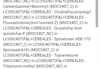
By hovering over the number of molecules, an information bubble appears with the list of molecules contained in the filter.
ISTD molecules are represented with a badge  .
.

Global filter creation
Clicking on the create button  opens the global filter creation window:

The creation window includes a mandatory editable field for entering the filter title:
As filters are shared between all users, the title field blocks the creation of a filter already bearing the name entered in the field. A message is displayed:
If this field is empty, the filter cannot be created and the save button is disabled:  .
.
On the left-hand side is the list of molecules available to add to the filter:

By default, all ISTD molecules are pre-selected so that they can be added directly to the filter. They are represented by the badge  .
.
A search box allows you to enter the name of the molecule you are looking for to build the filter more easily:

In the centre are 2 buttons that can be used to move a selection from one list to another, in order to add or remove molecules from the filter:
 Adds available molecules to the filter
 Removes molecules from the filters to the list of available ones
The right-hand side lists the molecules that will be in the filter:

Molecules must be added to this list to create a filter.
ISTD molecules are pre-selected so that they can be added directly to the filter. They are represented by the badge .
A search box allows you to enter the name of the molecule you are looking for to build the filter more easily:

⚠ Displaying the list filtered by a search does not constitute the list that will be saved in the filter.
If no molecule is present in the list on the left  , the filter cannot be created and the save button is disabled: .
If a name is entered and the filter list contains molecules, the save button is activated:
 . Clicking on it saves the filter. The
  button cancels the filter creation and closes the filter creation window.
Global filter edition
Clicking on the edit button  opens the global filter editing window:

This is the same view as for creation. (see Creation)
However, on opening, the name of the filter is automatically entered in the field allocated for this purpose and the list of filter molecules is filled with the molecules contained in the filter.
The edit validation button is 
Global filter deletion
Clicking on the delete button  opens a confirmation message:
 *
*  : Permanently removes the filter for all users
*
: Permanently removes the filter for all users
*  : Cancels the deletion.
Compound table panel

The result table contains sortable columns, multiple selection and customisation as explained in section Tables.
Clicking on a line in the table displays the calibration graph for the compound in the Calibration Panel (the text is displayed if no selection is made, or  if the selection is an ISTD), the line is then displayed with a coloured background so that you can see which line in the table corresponds to the graph displayed. The Compound Chromatogram Panel automatically scrolls to display the associated chromatogram.
Double-click on a line to open the compound in its Compound view.
Some values in the table may be displayed in colour. This means that additional information is visible. The colour defines the level of the message (Info, Warning, Error). If you hover over the value, a detail bubble is displayed:

Details of specific columns :
- Selection (see Tables):
- Choice of multi-selection possible if the analysis is of a type other than “sample” or “other”:
 : Validation OK / Validation KO / Validation relaunch.
- Choice of multi-selection possible if the analysis is of the “sample” or “other” type:
 : Validation Detected / Validation Not Detected / Validation retry.
- Flags (see Flags)
- Req : the
 pictogram indicates that the compound is requested by the client.
 - Modified (see Modification)
- Validation (see Validation) :
- Possible choice of validation if the analysis is of a type other than “sample” or “other”:
 validation in OK,
  validation in KO,
  validation in relaunch.
- Possible choice of validation if the analysis is of the “sample” or “other” type:
 validation as detected,
  validation as not detected, validation as relaunch.
- M/Z: Possibility of choosing the transition (main channel) of the compound via a drop-down list:

The current transition is displayed on a grey background.
- Actions: the
 button displays a window in which you can modify all the compound's parameters using editable fields:

Once the changes have been made, you can save by clicking on the  button or cancel by clicking on the
  button.
Compound chromatogram panel

The chromatogram panel is a different view of the compounds displayed in the Compound Table Panel. It displays the detected retention time curve for each compound in the form of a grid.
Clicking on a chromatogram displays the calibration graph for the compound in the Calibration Panel (the text is displayed if no selection is made, or if the selection is an ISTD), the chromatogram is then displayed with a coloured background to identify which chromatogram corresponds to the calibration graph displayed. The Compound Table Panel automatically scrolls to the line of the corresponding associated compound.
Double-click on a chromatogram to open the compound in its Compound view.
Use the slider on the left to change the size of the tiles in the grid:


For details of chromatograms, see section Chromatogram.
Calibration panel
For details of calibration, see the section Graphics sub-panel.
Compound view
Global view

Detailed view
The view is divided into 5 zones:
When the separator between 2 panels is present and represented by , it is then possible to change the display proportions between them. By hovering over the separator, the indicator changes to indicating that you can click and move the separator.
Information panel
The information panel shows the most important information about the analysis. On the first line at the top :
- Batch name: here Shim 29_02-11-20 evening
- The compound name: here 2.4-D
- The event number: here 423
- Screening retention time: here 3.637
- The name of the ISTD: here 2.4-D D3. The name is displayed in a drop-down list allowing you to change the ISTD.
 : This button takes you directly to the ISTD page in the Compound View.
The second line shows the filters applied to the Analysis table panel and to the Analysis chromatogram panel :
- Main filters :
- : Compounds that have been requested by the customer
- : Compounds not yet validated
- : Compounds validated in OK (only for compounds of type other than “Sample” or “Other”)
- : Compounds validated in KO (only for compounds of type other than “Sample” or “Other”)
- : Compounds validated in Detected (only for compounds of type “Sample” or “Other”)
- : Compounds validated in Not Detected (only for “Sample” or “Other” compounds)
 : Compounds validated as Relaunch (only for compounds of type “Sample” or “Other”)
- Search filters:
The search is based on the values displayed in the columns of the Analysis table panel. This “search” filter is also applied to the Analysis chromatogram panel. When an entry is made in the search field, a cross appears to delete the search entry and remove the filter applied to the table:
On the status, validation and miscellaneous filters, a bubble is displayed to indicate the number of elements corresponding to the filter:  .
.
When a filter is activated, its theme changes from grey to the chosen secondary colour (by default, orange):
The information panel can be reduced to increase the display area for the other panels. When you hover over the panel, a tick appears:
Clicking on it reverses the tick and retracts the panel:
In retracted mode, the tick is always visible.
Analysis table panel

The result table contains sortable columns, multiple selection and customisation as explained in section Tables.
Clicking on a line in the table displays the calibration graph for the analysis in the - Calibration Panel (the text is displayed if no selection is made, or if the selection is an ISTD), the line is then displayed with a coloured background so that you can see which line in the table corresponds to the graph displayed. The analysis chromatogram panel automatically scrolls to display the associated chromatogram.
Double-click on a line to open the analysis in its Analysis View.
Some values in the table may be displayed in colour. This means that additional information is visible. The colour defines the level of the message (Info, Warning, Error). If you hover over the value, a detail bubble is displayed:
Details of specific columns :
- Selection (see Tables) :
- Choice of multi-selection possible if the analysis is of a type other than “sample” or “other”:
: Validation OK / Validation KO / Validation relaunch.
- Choice of multi-selection possible if the analysis is of the “sample” or “other” type:
: Validation Detected / Validation Not Detected / Validation relaunch.
- Choice of multi-selection possible if the analyses are of the mixed type:
 : Validation Detected, OK / Validation Not Detected, KO / Validation restart.
ℹ In the case of a multiple selection where the analyses are of the mixed type, a finer selection window is displayed:

 : Keeps the original selection active. No changes are made to the selection.
 : Keeps only the “sample” analyses from the original selection. A dot shows the number of analyses included in this type:
  .
. : Keeps only “other” analyses from the original selection. A dot shows the number of scans included in this type:
  .
.
- Flags (see Flags)
- Req : the pictogram indicates that the compound is requested by the client.
- Modified (see Modification)
- Validation (see Validation) :
- Possible choice of validation if the analysis is of a type other than “sample” or “other”:
validation in OK, validation in KO, validation in restart.
- Possible choice of validation if the analysis is of the “sample” or “other” type:
validation as detected, validation as not detected, validation as relaunch.
- M/Z: Possibility of choosing the transition (main channel) of the compound via a drop-down list:
The current transition is displayed on a grey background.
Analysis chromatogram panel

The chromatogram panel is a different view from the analyses displayed in the Analysis table panel. It displays the chromatogram for each analysis in the form of a grid.
Clicking on a chromatogram displays the calibration graph for the analysis in the [#calibration_panel|Calibration panel]] (the text is displayed if no selection is made, or if the selection is an ISTD), the chromatogram is then displayed with a coloured background to identify which chromatogram corresponds to the calibration graph displayed. The Analysis table panel automatically scrolls to the line of the corresponding associated compound.
Double-click on a line to open the analysis in its Analysis View.
Use the slider on the left to change the size of the tiles in the grid:


For details of chromatograms, see section Chromatogram.
Calibration panel
For details of calibration, see the section Graphics sub-panel.
Method file converter
If the file’s method format is supported by the COD Platform, this tool enables conversion of a method file or other compatible files into a standard COD method file format (.cod.xlsx).
To use the tool, click on:

A window will then appear:

In this window, click on the 'Upload method file' button and select a compatible method file from the file explorer.
Next, a reference configuration can be chosen, which is recommended in most cases if available. This will retain specific information from an existing COD method file, such as chromatogram settings for various compounds.
If a reference configuration is not used, a filename will need to be specified.
Once all settings are configured, click on 'Convert.' If the file is processed successfully, a .cod.xlsx file will be generated and downloaded to the computer.
Troubleshooting with user preferences
Following manual modifications to user preferences (Settings Panel), it may happen that these modified user preferences cause the application interface to freeze. This may prevent the application's main menu from being displayed and therefore prevent access to the user preferences panel in order to correct the error.
To solve this problem, there is a special page accessible via the following URL:
https://[base_url:port]/[platform]/?clean

This web page displays only a large button  in its centre. Clicking on the button erases all user preferences and resets them to their default values.
⚠ This action is irreversible and all user preferences are lost.